Equipment
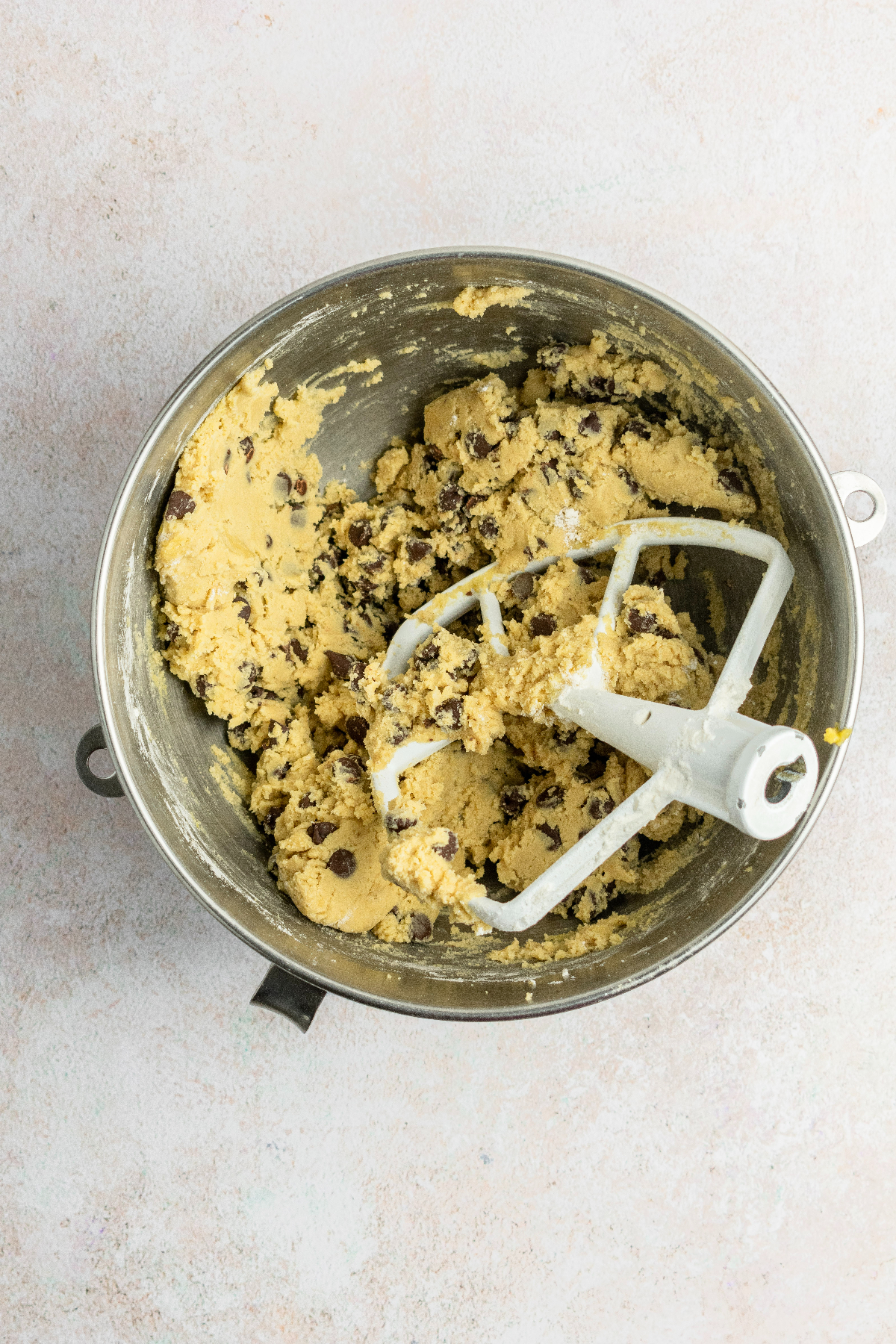
- Stand Mixer or Electric Hand Mixer
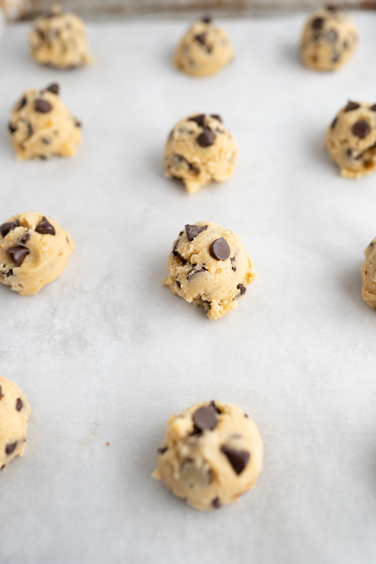
- Cookie Scoop *optional*
- Parchement Paper, Silicone mat or Cookie Sheet

__Prep Time: 15 minutes___ Cook Time: 10 minutes___ Servings: 30 servings__

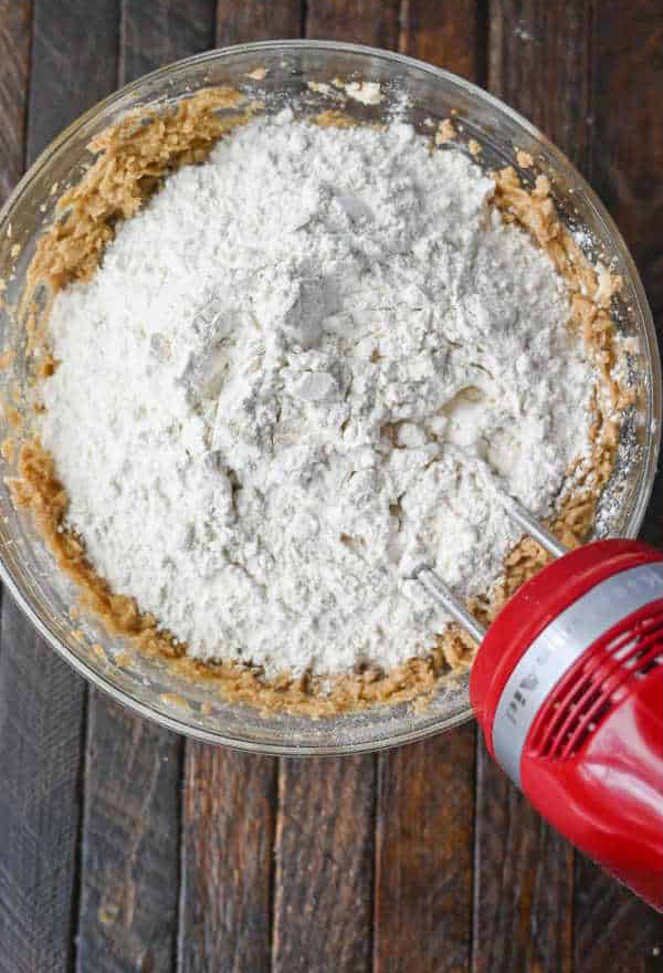
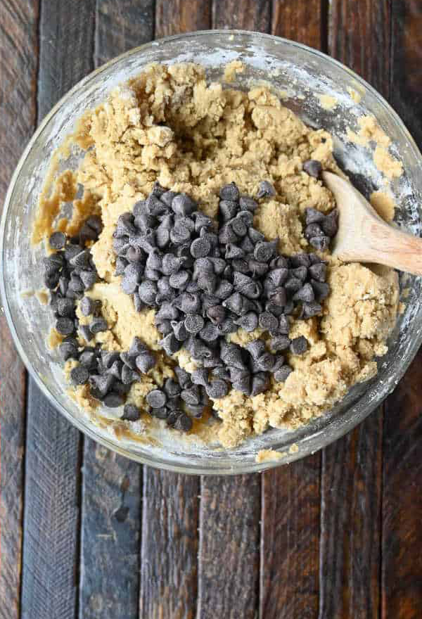
*3/4 cup butter -- 1/2 cup granulated sugar -- 1/2 cup brown sugar*
*1 egg -- 1 tbsp vanilla extract*
*2 cups flour -- 1 tsp baking soda -- 1/2 tsp salt*
I found the epicurious webstie very easy to navigate and straight to the point. When looking at recipes the pages are not overwhelemed with images or side stories on how a persons grandmother stumbled upon the perfect cookie recipe while following the yellow brick road. Its very condense and the ingredients/methods of preperation are very easy to find and understand.
Pinch of Yum is a very easy website to naviagte when trying to find different dinner recipes to cook. It also allows for very interesting visuals that feel very girlish and welcoming. Additionally, the website allows you the option to skip ahead certain parts of the page, and for the most part, has all of their different sections organised and labeled.
Food. is also another food website that is very easy to navigate, though its a little congested with information when opening to the main page. However, when looking at their recipes the pages are more condensed and straight to the point. Though its organized in an interesting way having the ingredients and the preperation steps next to eachother (seems a little confusing).
I feel like The New Yorker is one of those websites that is very visual interesting to look at, and they create hierchy through their methods of organization is very interesting. I especially enjoy how interactive their website is.
I also enjoy the way The New York Times sets up their website in the way that a physical newspaper would be set up. Since a newspaper is already a set visual language most people are familiar with, it makes it easier to navigate the website when following those visual cues.
Vanity Fair is like the NYT in how it utlizes the standard layout of a magazine to influence how visual heirarchy is translated to web form. I also particularly like how interactive it is when it comes to changing the size of the window, transforming to your visual needs.